Wednesday, May 30, 2012

Be Inspired! Decorating Trends for 2013

As artists, we are always looking ahead to see what great ideas are on the horizon.  This can inspire and push us to our creative limits.  As creative consumers, you have unique and discerning tastes, but it is always inspiring to see what is coming.  So we thought we would show you six trends for 2012 and 2013.

Nostalgia

As we get more driven by our computers and the virtual world that it creates, the more we crave the tactile things of the past.  We will see old things repurposed, such as old ship signs made into coffee tables, or old lights made new again.  Keep the ageless look and add a modern purpose.


Repurpose and Reuse

This next category can overlap with the first.  But we will take it a step further.  We have become a more earth-friendly conscientious people.  A perfect way to extend this into our homes is by using the things we already have instead of throwing them away.  Okay, because our things may be bit dated, we give them new life and either use them in the same way or repurpose them.  Take your dated dressers, add a painted finish and you have an updated piece.  Or take reclaimed wood and transform it into a chair!


 Reclaimed wood made into a really cool chair.


Old brass chandelier with a painted to finish!  Gorgeous! www.fauxfurniturerehab.com


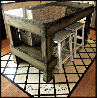
An antique table with a layer of zinc.  Love it!  www.scarlettseales.com


Left: Salvaged horse stall door reused as a pantry door.  Right: Salvaged wood place on metal hinges and use as contemporary door.


Industrial

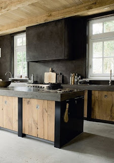
The combination of the warm woods and the cold metal metals meet and make a unique industrial look that can be fused with eclectic, modern or vintage.


Gold

Gold accents in home decor bring a richness to any room.  Gold rugs, lamps and mirrors are fabulous accent pieces.


gold vignettes via www.brandwave.org

Eco-Friendly


The earthy earth-friendly appeal of these rooms speak to our love of nature and care for our environment.  This style always lends itself to a less cluttered, more zen-like environment that promotes relaxation. 


Animal Prints


Take all of the above and add a splash of animal print to mix things up and bring some fun and character into a room.  I especially love the zebra rugs!


Thursday, May 3, 2012

Updating Beams

We have been so busy these last few months that I have really neglected blogging.   But I wanted to share with you a job that I did that involved beams.  This house had a lot of beams that were very dark.  They were beautiful but due to the shear number of beams, they felt heavy and weighty.  So we lightened them up but wanted to keep an aged look to them.  So here is the transition.

Here is one of the rooms that had the beams and they went into the next room.  Once again, beautiful but heavy, and it felt like it lowered the ceiling.


So we went to work.  First, we covered everything to protect floors, walls and airvent.


Then we aged the beams to a lighter color but gave them character!  The lighter color literally lifted the ceilings, or so it felt, and opened up the room.  But the integrity of the room was maintained.  The result was fabulous.  This room has ageless character but the beams are no longer  the focus rather an embellishment to the entire style of the room.


Up close and personal.  Who would ever guess that these are painted?


Friday, February 10, 2012

What's Hot This Week on Pinterest

Thought it might be fun to see what is popular with furniture on pinterest.  I have posted a few pictures that reflect the work I can create.

I love the stencil on the ceiling.  The big bold design is very eye-catching and really makes a statement.


This next piece mixes the old with the new.  The antique table is distessed and paired with the distressed chairs.  I love that they do not match but add a great accent.


The darkened beams in this kitchen work well with all of the white and stainless steel.  I do a lot of beams.  Clients are either adding them for interest on high ceilings or changing the color to give it an updated look, even if that is a distressed look!


This table has been painted and distressed. Although I don't really like the top of the table, I think what people love about this is the fun color mixed with the distressed base.  This is a great example of taking what your already have and doing something great with it.


Fun, weathered door that adds interest to the kitchen.  


Pinterest had a lot of great ideas.  Take a look and get inspired!!  For more inspiration check out our new site www.fauxfurniturerehab.com


Marc 

Monday, June 20, 2011

Re-Invent Your Furniture!

Sign up to follow our blog by June 30th and you will be entered into our drawing for a $50 gift certificate to Blue Mesa Restaurant! 
For some reason our "follow" button does not always appear.  If you want to be entered into the contest send us a quick email at marc@holdenartstudio.com and you will be entered.


Re-Invent Your Furniture
or
Fall Back in Love with What You Already Have!

Our latest project involved re-finishing a king-sized four poster bed and matching desk from Henredon.  The furniture was good quality, but was finished in the "whitewashed" oak stain that was popular back in the 80's...great look 20 years ago, but it needed some updating!  The finish had yellowed somewhat, which is typical for lacquer and oil-based finishes.  Oftentimes, people don't think of the application of a "faux finish" to furniture or cabinetry, but it is a wonderful, economic way to "re-purpose" and update what you already have!


Here are the bed and desk before.  Both are in great shape, just in need of a facelift!


When it comes to furniture, there are really only 4 options:


1.  Buy a new piece of furniture. Great option unless your budget is limited; or maybe you love the piece, but the finish just doesn't work. Many people just hate the thought of scrapping a "perfectly good" piece, especially if you are talking cabinetry, which can be a messy, not to mention expensive, ordeal!

2.  Paint it. Though this is the easiest option, it may not give you the look you want.

3.  Strip the old finish and re-stain it. Though viable for small, simple pieces, stripping is a toxic and messy process that is best done outdoors. The gummy residue is difficult to remove from grooves and corners, and all the digging and scraping can result in scratching the wood. When it involves cabinetry, believe me that you don't want this in your house!

4.  Faux finish it. This is where we come in. By layering glazes over the original finish, we can achieve whatever look you want without the mess of stripping, or the expense or waste of buying new.


In this case, our client wanted a simple stained wood look, changing the bleached oak to a darker, mocha color.

Here is the approved sample showing the new custom "stain" color, which is really a faux finish, imitating a wood stain.

Jesse Reyes of Reyes Movers delivers the bed and desk to our shop.  Jesse does great work, plus he's not nearly as scary as this picture makes him look!


First things first.  We clean and hand-sand every piece to ensure good adhesion.  Here my 16-year old daughter Madeline earns some extra summer money while learning the finer points of the "grunt" work!


The glazes are applied by hand to ensure a quality result.

Here is the desk in progress.  Each inlay around the perimeter of the desktop was finished individually.  The sample is always nearby to ensure accuracy.
   

Thursday, May 26, 2011

scroll design in progress


Sign up to follow our blog by June 30th and you will be entered into our drawing for a $50 gift certificate to Blue Mesa Restaurant!


Scroll Design on a Vaulted Ceiling


I just finished this project, in which the client wanted me to create a scroll design on this vaulted entry ceiling.  The ceiling is about 15' high, and measures about 15' diagonally from corner to corner.

The idea began with a pencil drawing for the client to approve.


The next step was a painted sample for the client's approval.  We decided not to incorporate any metallics, but to accent the bronze tones with a faded blue reflected in her fabrics.

Once the design and colors were approved, I made a full-scale image of the scrollwork that could be transferred to the ceiling.  With a few quick measurements and chalklines, I was able to layout the design relatively quickly.  The ceiling isn't exactly square, so I had to "pinch" and "stretch" the design here and there to fit symmetrically.


Here's a shot of my work platform with the design halfway complete.  My neck was angry with me for several days!


Up close.  The design has varied light and dark areas to give it a worn feel.  The blue accents bring in a touch of color.  The thin outline helps to give it definition.


The completed painting...just need to install a matching fire sensor cover and hang the light fixture.

Thursday, February 10, 2011

American Clay Plaster

American Clay 100% Natural Earth Plaster:
"Quite Possibly the World's Most Beautiful Wall Finish"
The understated beauty of American Clay's Natural Earth Plaster and their stunning line of earth-rich colors are the perfect backdrop for any room.

What is the future for interior wall coverings?  While the 80's and 90's "more is more" mentality witnessed the dominance of the faux finish, the 21st Century has taken a more minimalist approach. 

Savvy homeowners want simplicity and comfort.  They want innovative products that push the boundary between art and function.  They want softness and texture, while using natural products that enhance their homes.

So, are homeowners limited to the choice between paint and wallpaper? 

Though low odor, low-VOC paints have made significant advancements and wallpapers have made a dominating comeback, are there other options that allow them to bring texture, softness and color into the home without becoming "fussy?"

The answer is yes:

The subtle texture of American Clay's Loma imparts a softness to the walls without being fussy.

Here at HoldenArt Studio we offer a beautiful solution.  American Clay's 100% Natural Earth Plaster, applied by our certified applicators, is an organic wall plaster made from natural clays and reclaimed natural aggregates such as sand, mica and seashell. 

The organic clay plaster's natural matte finish is simple and beautiful, adaptable to most any design style.  The plaster's luxurious texture is irresistible to touch.  Because the organic clay "breathes," it improves the air quality of the home and resists dust and mold.  Best of all, it is easy to clean and touch up.  I believe that it is the most innovative wallcovering product on the market today.


The clay plaster is versatile, allowing for all sorts of artistic applications.  Here is an example of a floral wall design and background texture using American Clay Natural Earth Plasters.


Why American Clay Earth Plaster?
  • 100% Natural
  •  beautiful finish
  • non-toxic
  • mold resistant
  • absorbs odors
  • easy to repair
  • temperature and humidity buffer
  • contributes up to 10 LEED Credits
  • zero VOC's
  • non-fading
  • easy clean-up


Why HoldenArt Studio?
  • certified American Clay applicator
  • 16 years experience in the decorative arts
  • professional and dependable
  • designer references